Design

Shade of Brutalism

คำพูดหนึ่งที่นิยามสถาปัตยกรรม Brutalism ได้ดีโดยไม่ต้องบอกว่ามันคืออะไร คือคำกล่าวที่ว่า “ถ้าใครไม่รัก ก็เกลียดเลย”

Photo: Declan Sun (Unsplash.com)

เหตุผลของการเกลียดคงเป็นเพราะ สำหรับใครหลายๆ คน Brutalism ที่อยู่ในรูปทรงเรขาคณิตและคอนกรีตเปลือยที่เหมือนสร้างไม่เสร็จตลอดกาล เป็นตึกที่ใหญ่เทอะทะ แข็งกระด้าง เย็นชา แต่สำหรับคนที่หลงรักตั้งแต่แรกเห็น เส้นสายและรูปทรงเหล่านั้นกลับให้ความรู้สึกหนักแน่น ส่วนคอนกรีตเปลือย ไร้ซึ่งการตกแต่งฟุ่มเฟือยใดๆ คือความเรียบ เท่ และเหนือกาลเวลา 

สถาปัตยกรรม Brutalism เกิดขึ้นหลังสงครามโลกครั้งที่ 2 สิ้นสุด และรุ่งเรืองอยู่ในยุค 1950-70s ซึ่งส่วนมากเป็นอาคารราชการและสถาบันทางวัฒนธรรมต่างๆ แต่หลังจากนั้น Brutalism ก็เริ่มหมดความนิยมด้วยสาเหตุที่หลายคนมองว่ามันเป็นรอยด่างของเมืองที่สื่อถึงความเสื่อมสลาย ในแบบเดียวกันกับที่ภาพยนตร์แนวดิสโทเปียมักนำสถาปัตยกรรม Brutalism ไปใช้เป็นฉากหลัง 

อย่างไรก็ดี ในศตวรรษที่ 21 นี้ Brutalism กลับมาเกิดใหม่อีกครั้ง และในอวตารครั้งนี้ที่ดูจะเปลี่ยนการรับรู้จากงานออกแบบที่กระด้างเย็นชาให้กลายเป็นความล้ำสมัย ก็อาจทำให้ใครหลายคนที่เคยเกลียด Brutalism เปลี่ยนใจหันกลับมาหลงรักก็เป็นได้ 

Photo: Marcel Strauss (Unsplash.com)

อย่างไรก็ดี ในศตวรรษที่ 21 นี้ Brutalism กลับมาเกิดใหม่อีกครั้ง และในอวตารครั้งนี้ที่ดูจะเปลี่ยนการรับรู้จากงานออกแบบที่กระด้างเย็นชาให้กลายเป็นความล้ำสมัย ก็อาจทำให้ใครหลายคนที่เคยเกลียด Brutalism เปลี่ยนใจหันกลับมาหลงรักก็เป็นได้ 

Photo: David Underland (Unsplash.com)

Contemporary Brutalism และการตีความใหม่ในโลกแฟชั่น

ใน 3-4 ปีที่ผ่านมา เราได้เห็น Brutalism กลับมาฮ็อตในงานออกแบบรีเทลของหลายแฟชั่นแบรนด์ดัง​ โดยการกลับมาครั้งนี้ Brutalism มักถูกนำไปผสมผสานกับงานออกแบบแนวอื่นๆ จนกลายออกมาเป็นนิยามที่นักออกแบบหลายคนเรียกว่า Contemporary Brutalism

Saint Laurent
Photo: dkstudio (dkstudio.ca)

Saint Laurent บน Bloor Street ในโตรอนโต เป็นหนึ่งในงานออกแบบที่ผสมผสาน Brutalism เข้ากับสไตล์อื่นได้อย่างน่าสนใจ ผนังอาคารด้านนอกของตัวร้านเป็นงานคอนกรีตโทนสีเทาที่มีพื้นผิวเป็นลายเส้นริ้วแบบผ้าลูกฟูก ประตูทางเข้าล้อมกรอบด้วยคอนกรีตผิวเรียบ โดยวางประตูไว้ในช่องเว้ารูปทรงเรขาคณิต คอนกรีตสีเทายังคงดำเนินต่อเนื่องไปภายในตัวร้าน แต่ Creative Director ของแบรนด์ Anthony Vaccarello และ สถาปนิกจากแคนาดา dkstudio เลือกใช้คอนกรีตร่วมกับวัสดุอื่น เช่น ไม้และหินอ่อนโทนสีครีมลายเส้นแบบงานพู่กัน ทำให้เกิดความรู้สึกอบอุ่นและมีศิลปะมากขึ้น

Photo: Courtesy of Saint Laurent

Saint Laurent บน Bloor Street ในโตรอนโต เป็นหนึ่งในงานออกแบบที่ผสมผสาน Brutalism เข้ากับสไตล์อื่นได้อย่างน่าสนใจ ผนังอาคารด้านนอกของตัวร้านเป็นงานคอนกรีตโทนสีเทาที่มีพื้นผิวเป็นลายเส้นริ้วแบบผ้าลูกฟูก ประตูทางเข้าล้อมกรอบด้วยคอนกรีตผิวเรียบ โดยวางประตูไว้ในช่องเว้ารูปทรงเรขาคณิต คอนกรีตสีเทายังคงดำเนินต่อเนื่องไปภายในตัวร้าน แต่ Creative Director ของแบรนด์ Anthony Vaccarello และ สถาปนิกจากแคนาดา dkstudio เลือกใช้คอนกรีตร่วมกับวัสดุอื่น เช่น ไม้และหินอ่อนโทนสีครีมลายเส้นแบบงานพู่กัน ทำให้เกิดความรู้สึกอบอุ่นและมีศิลปะมากขึ้น

Axel Arigato
Photo: Axel Arigato (axelarigato.com)

Axel Arigato แบรนด์รองเท้าจากสวีเดนก็มีช็อปที่ใช้คอนกรีตเป็นพระเอกอย่างเด่นชัดอยู่ที่โคเปนเฮเกนเช่นกัน โดยนอกจากความหนักแน่นของคอนกรีตเปลือยและเส้นสายเรขาคณิตแล้ว ตรงกลางร้านยังมีบันไดขนาดใหญ่ตั้งอยู่เด่นเป็นสง่า และที่สะดุดตาไม่แพ้กันคือ ท่ามกลางฉากหลังที่เป็นสีคอนกรีตเปลือยนั้น ผู้ร่วมก่อตั้งแบรนด์ Max Svardh และสถาปนิก Christian Hallerod เลือกจัดวางโพเดียมสีสันจัดจ้านที่ทำจากวัสดุเจสโมไนต์แวววาวอยู่ภายในร้าน รวมถึงประติมากรรมรูปก้น ‘#SilverDerriere’ ที่ออกแบบร่วมกับศิลปิน Kiri-Una Brito Meumann

Photo: Axel Arigato (axelarigato.com)
Khaile
Photo: KHAITE (khaite.com)

รีเทลใน SoHo ของแบรนด์แฟชั่นหรู Khaile โดย Cate Holstein อาจไม่ได้เป็นการนำความดิบเปลือยของ Brutalism ไปจัดวางร่วมกับงานออกแบบแนวอื่น แต่นี่เป็นอีกหนึ่งงานออกแบบที่เราอยากพูดถึง เพราะภายในตัวร้านที่ผนังฉาบปูนโทนสีเทา เกลี่ยด้วยเกรียง โดยทิ้งร่องรอยความไม่สมบูรณ์ที่เกิดขึ้นระหว่างกระบวนการไว้ โต๊ะจัดวางสินค้าทำจากคอนกรีตดิบๆ และราวแขวนเสื้อเหล็กสีดำ กลายเป็นฉากเรียบนิ่งที่ช่วยขับให้สินค้าชิ้นต่างๆ โดดเด่นขึ้นมา

Photo: KHAITE (khaite.com)

จริงๆ แล้ว นักออกแบบหลายคนก็เลือกใช้ Contemporary Brutalism เพราะต้องการให้มันเป็นฉากหลังที่สมบูรณ์แบบสำหรับสินค้าแฟชั่นของพวกเขา นี่เป็นเรื่องที่ย้อนแย้งอยู่พอสมควร เพราะแรกเริ่มเดิมที การใช้วัสดุราคาถูก รูปทรงเรขาคณิต และไร้ซึ่งการตกแต่งใดๆ ที่เกินความจำเป็นของ Brutalism เป็นการแก้ไขปัญหาการขาดแคลนทุนและวัสดุในช่วงเวลาหลังสงคราม แต่พอมาใน พ.ศ.นี้ Brutalism กลับกลายเป็นฉากหลังให้ไฮแฟชั่นได้ใช้ความน้อย หนักแน่น นิ่ง เรียบ ดิบ เท่ ช่วยเสริมความงามหรูหรายิ่งโดดเด่นขึ้น

Raw Architecture ท้าทายขนบเดิมๆ ของไฮแฟชั่น

แต่แบรนด์ที่รับเอาสไตล์ของ Brutalism ไปใช้แบบเต็มๆ ขนาดที่ว่าแทบจะแปลได้ตรงตัวจากรากศัพท์ภาษาฝรั่งเศสของ Brutalism หรือ “Béton brut” (แปลว่า raw concrete) นั่นก็คือ Balenciaga ที่มาพร้อมกับธีมงานออกแบบรีเทลของพวกเขาว่า Raw Architecture 

Balenciaga flagship in the United States (Photo: balenciaga.com)

Demna ครีเอทีฟไดเร็กเตอร์ของแบรนด์ให้เหตุผลว่า เขาต้องการใช้งานออกแบบ Raw Architecture หรือสถาปัตยกรรมที่ดิบ เปลือย และแทบจะไม่ตกแต่งอะไรเลย มาท้าทายขนบและสุนทรียะเดิมๆ ของงานออกแบบรีเทลแบรนด์แฟชั่นหรู โดยตั้งแต่ปี 2021 ที่ Balenciaga เริ่มใช้คอนเซ็ปต์นี้เป็นครั้งแรกที่รีเทลบน Sloane Street ในลอนดอน ไล่เรียงมาจนถึงที่ฮัมบวร์ก เยอรมนี ไมอามี และ SoHo นิวยอร์ก รีเทลของพวกเขาก็ปรากฏกายออกมาเหมือนร้านที่ยังตกแต่งไม่เสร็จ ใช้ทั้งคอนกรีตเปลือย ซีเมนต์ขัด และเปิดฝ้าโชว์งานระบบถ่ายเทอากาศแบบในโรงงาน ทั้งหมดให้ความรู้สึกถึงอาคารที่ถูกทิ้งร้างหรือยังอยู่ระหว่างการก่อสร้าง ไม่ว่าจะเป็น โกดังเก็บสินค้าเก่า อาคารจอดรถ ฯลฯ

ไม่เพียงแค่นั้น แต่บนผนังคอนกรีตยังโชว์รอยแตก คราบดำ ผ้าม่านเปียก หรือโต๊ะอะลูมิเนียมที่มีรอยเปื้อน เรียกว่าดิบเถื่อนอย่างไม่แคร์ตัวเลขที่อยู่บนป้ายราคาสินค้า แต่รายละเอียดตรงนี้มีความฮาอยู่หน่อย เพราะตำหนิเหล่านี้ไม่ใช่สิ่งที่เกิดขึ้นเองอย่างเป็นธรรมชาติ แต่เป็นสิ่งที่ทางแบรนด์ตั้งใจสร้างขึ้นมาเพื่อให้ได้ความรู้สึกดิบตามคอนเซ็ปต์

Balenciaga Greene Street New York Flagship Store (Photo: balenciaga.com)

ไม่เพียงแค่นั้น แต่บนผนังคอนกรีตยังโชว์รอยแตก คราบดำ ผ้าม่านเปียก หรือโต๊ะอะลูมิเนียมที่มีรอยเปื้อน เรียกว่าดิบเถื่อนอย่างไม่แคร์ตัวเลขที่อยู่บนป้ายราคาสินค้า แต่รายละเอียดตรงนี้มีความฮาอยู่หน่อย เพราะตำหนิเหล่านี้ไม่ใช่สิ่งที่เกิดขึ้นเองอย่างเป็นธรรมชาติ แต่เป็นสิ่งที่ทางแบรนด์ตั้งใจสร้างขึ้นมาเพื่อให้ได้ความรู้สึกดิบตามคอนเซ็ปต์ 

Balenciaga - Store Hamburg(Photo: facebook.com/Balenciaga)
Balenciaga - Store Hamburg (Photo: facebook.com/Balenciaga)

นี่คือ Brutalism แห่งศตวรรษที่ 21 ในโลกแฟชั่น แม้รูปลักษณ์จะยังดิบเท่ไม่ต่างจากเดิม แต่ Contemporary Brutalism ที่ว่า ก็ไม่ใช่ผลผลิตจากข้อจำกัดของฟังก์ชันเหมือนในอดีต ตรงกันข้าม มันคือความดิบที่ถูกออกแบบขึ้นอย่างจงใจ เพื่อสร้างสไตล์และสื่อสารอัตลักษณ์ของแบรนด์

ก็ไม่รู้ว่าเราจะยังนิยามมันได้เหมือนเดิมหรือไม่ว่า “ถ้าใครไม่รักก็เกลียดเลย”

Share

“If you don’t love it, you hate it” — that’s a perfect phrase to describe Brutalist architecture without actually naming it. For many, its geometric forms and raw concrete feel unfinished, harsh, and cold. Yet, for those drawn to it, these lines convey an undeniable strength. The unadorned concrete embodies a stark beauty, a coolness, and a sense of timelessness.

Born after World War II, Brutalism flourished from the 1950s to the 1970s, primarily in government and cultural buildings. However, its popularity faded as it became seen as an urban blight, a symbol of decay often featured in dystopian films.

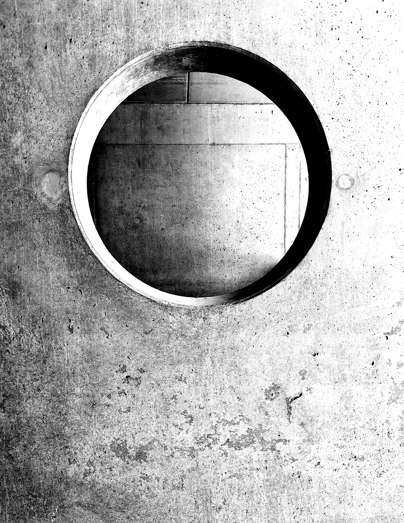
Over the past few years, Brutalism has experienced a significant resurgence in the retail design of many prominent fashion brands. This time around, Brutalism is often blended with other styles, leading to a new definition refer to as Contemporary Brutalism.

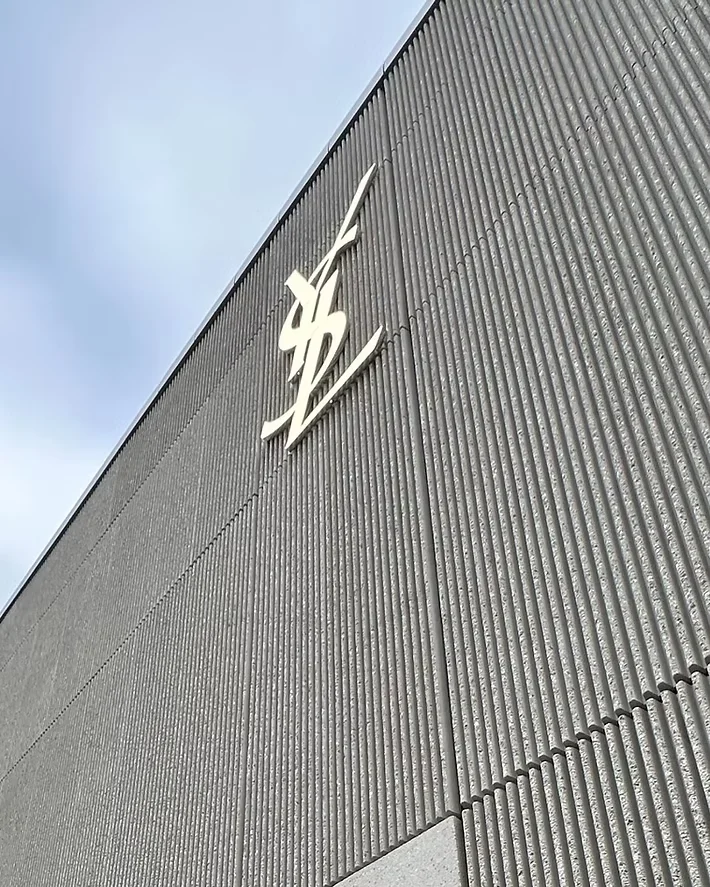
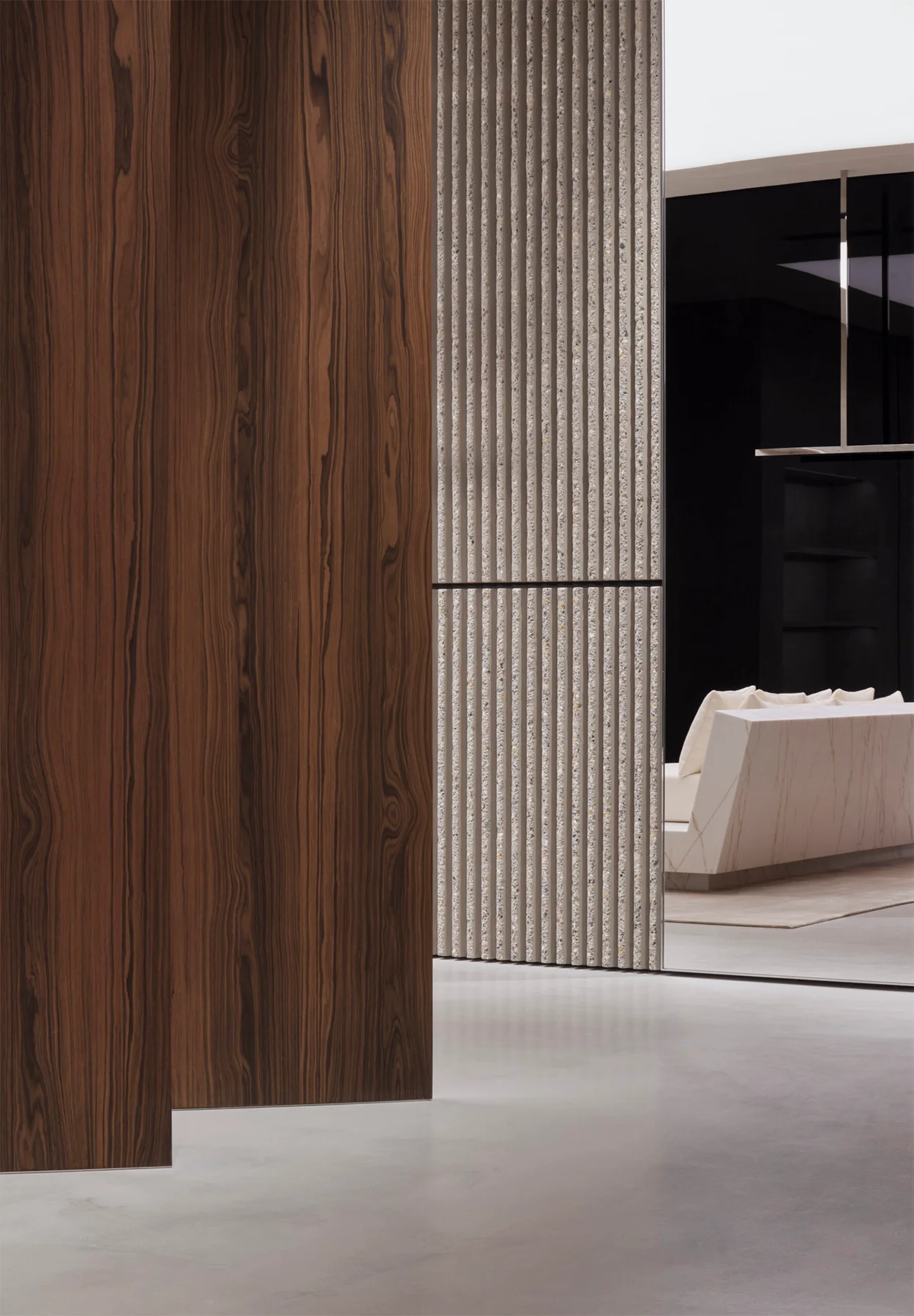
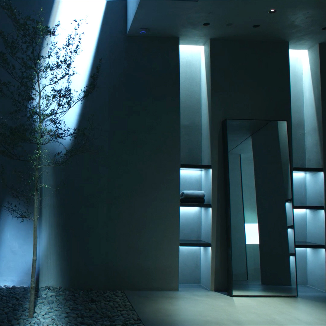
The Saint Laurent store on Bloor Street in Toronto serves as a fascinating example of Brutalism integrated with other aesthetics. The building’s exterior features grey concrete walls with a ribbed, corduroy-like texture. The entrance is framed by smooth concrete, set within a geometric alcove. This grey concrete theme continues inside the store, but Anthony Vaccarello, Saint Laurent’s Creative Director, and Canadian architects dkstudio have paired it with other materials. The incorporation of wood and cream-toned, brushstroke-patterned marble creates a warmer, more artistic ambiance.

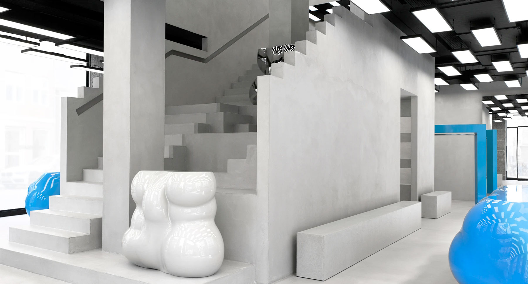
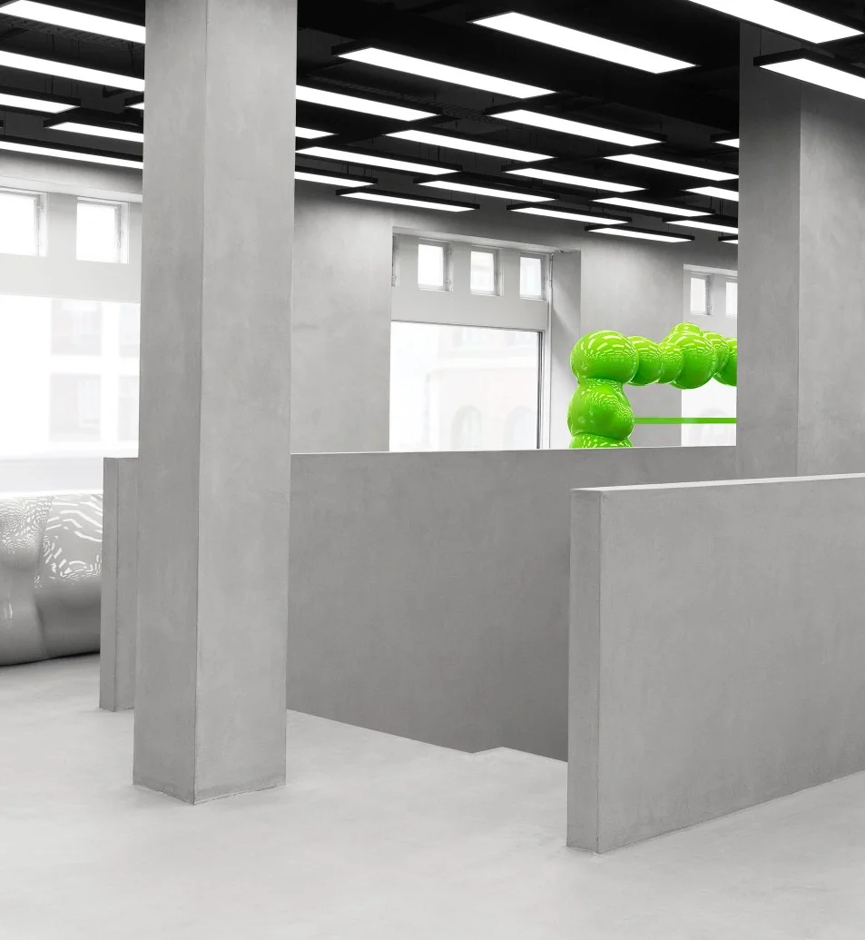
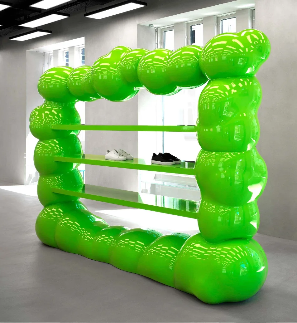
The Swedish footwear brand, Axel Arigato, also features a shop in Copenhagen where concrete plays a starring role. Beyond the raw concrete’s substantial presence and geometric lines, a grand staircase commands attention in the center of the store. Equally striking, amidst the bare concrete backdrop, co-founder Max Svardh and architect Christian Hallerod chose to punctuate the space with vibrant, shimmering Jesmonite display podiums. This bold choice extends to the prominent ‘#SilverDerriere’ butt sculpture, a collaboration with artist Kiri-Una Brito Meumann, adding another layer of unexpected artistry.

Though not explicitly merging Brutalism with other design styles, Cate Holstein’s vision for the luxury fashion brand Khaite’s retail space in SoHo warrants a closer look. Inside, the walls are finished with a trowel-applied grey plaster, intentionally showcasing the subtle imperfections inherent in the process. Raw concrete display tables and sleek black steel clothing racks combine to form a minimalist and serene backdrop, effortlessly highlighting each individual product.

Many designers chose Contemporary Brutalism precisely because it creates a perfect backdrop for their fashion products. This is quite ironic. Initially, Brutalism’s use of inexpensive materials, geometric forms, and minimal, unembellished aesthetics was a solution to post-war scarcity of funds and resources. Yet today, Brutalism serves as a powerful stage for high fashion, where its minimalist, robust, calm, sleek, raw, and cool qualities enhance the luxurious beauty of the products, making them stand out even more.

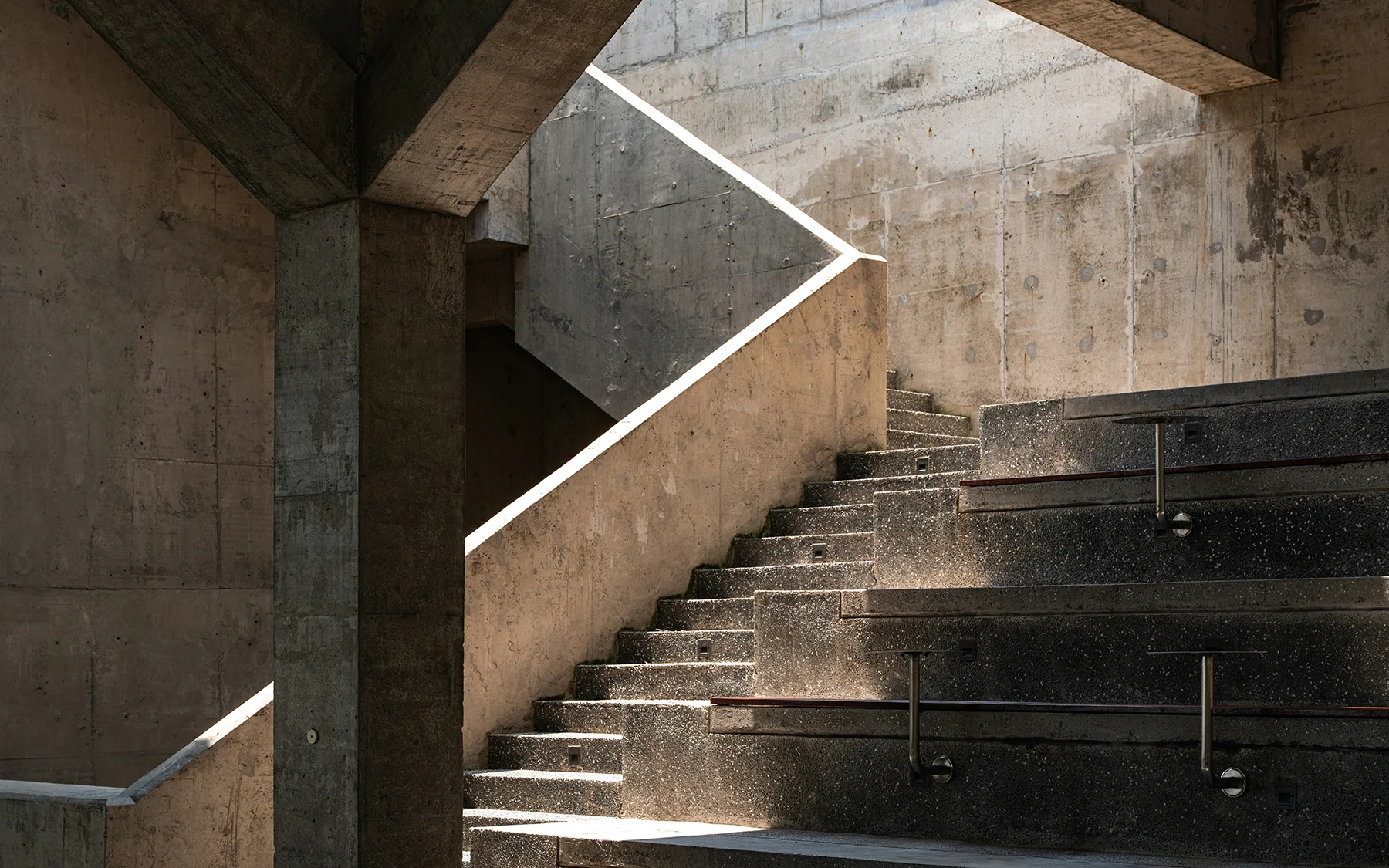
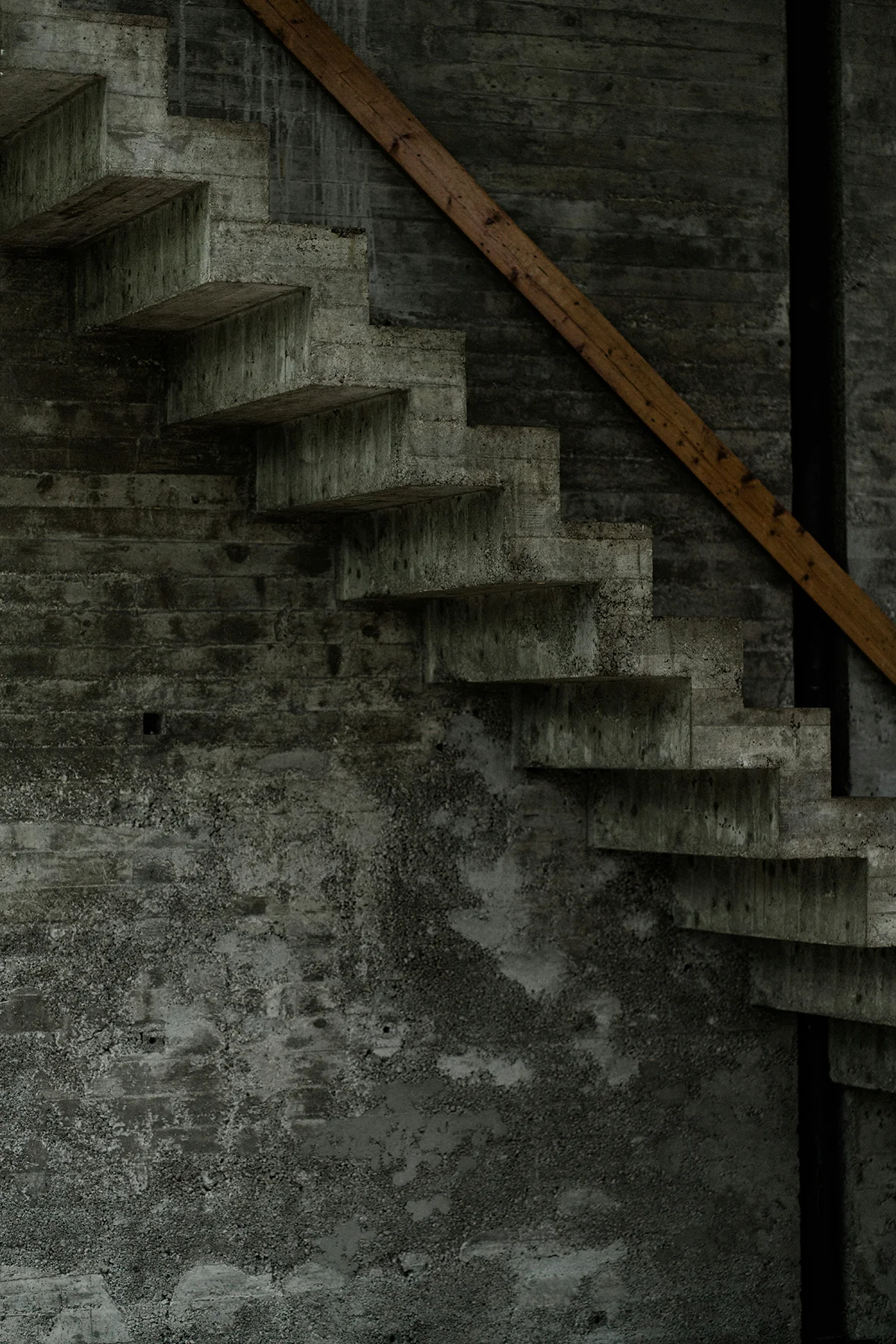
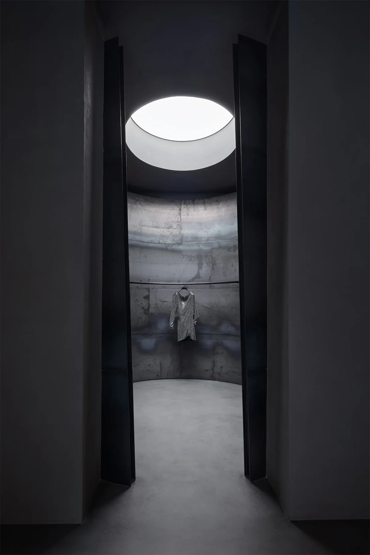
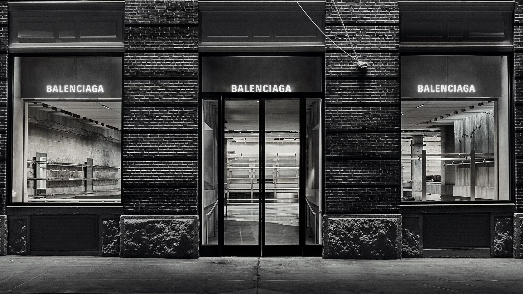
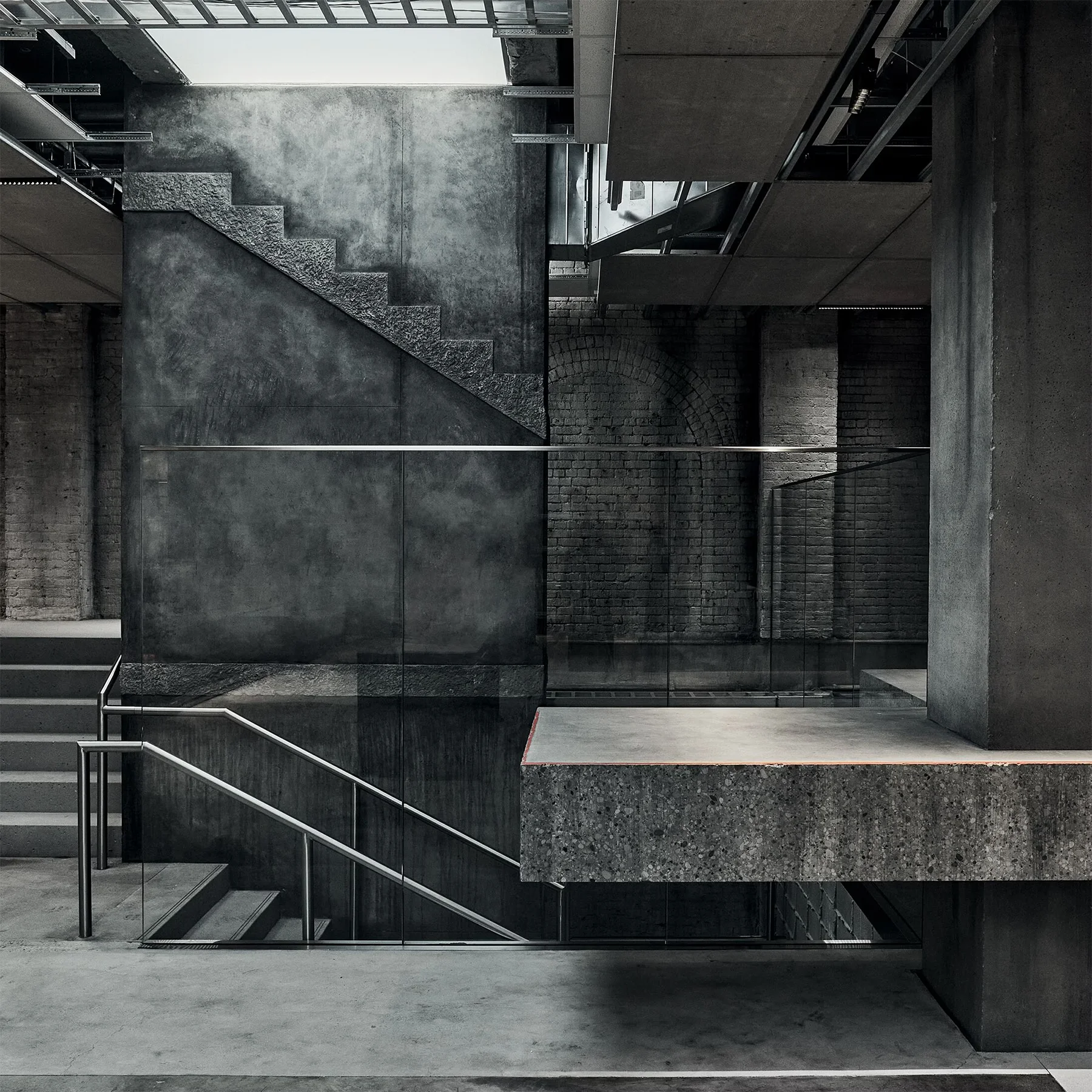
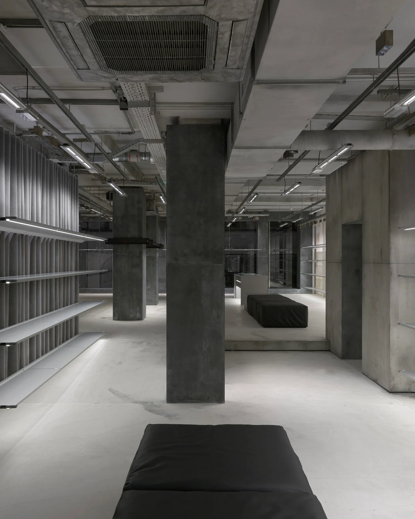
However, the brand that has embraced Brutalism’s style so completely that it almost directly translates from the French root word “Béton brut” (meaning raw concrete) is Balenciaga. They’ve boldly called their retail design theme “Raw Architecture. Demna, the brand’s creative director, aims to use a stripped-back, virtually undecorated style to disrupt the conventional aesthetics of luxury fashion retail. Since its debut at the Sloane Street store in London in 2021, and continuing through locations in Hamburg, Miami, and SoHo, New York, Balenciaga’s retail spaces consistently look unfinished. They feature exposed concrete, polished cement, and visible factory-style ventilation, creating an atmosphere reminiscent of abandoned buildings or active construction sites, like old warehouses or parking garages. Beyond that, the concrete walls intentionally display cracks, dark stains, and even seemingly damp curtains, while aluminum tables bear scuff marks. It’s a raw, almost defiant aesthetic, seemingly unconcerned with the price tags. The humor lies in these “imperfections” not being natural wear, but deliberately created to achieve the desired raw concept.

This is 21st-century Brutalism in fashion. While its look is still raw and cool, this Contemporary Brutalism isn’t born from past functional limitations. Instead, it’s a purposely designed rawness, crafted to forge a distinct style and communicate brand identity.

It makes you wonder if “If you don’t love it, you hate it” still applies.